UI Design   Design Systems

BillGO, Inc

Harmony Design System

6 weeks
Lead Designer
Here's the situation

BillGO, an emerging bill pay company, operates as a B2B Software-as-a-Service provider. Specializing in customizable bill pay solutions, they collaborate with banks to tailor their offerings to match the individualized experience of each partner institution.

So how can BillGO establish a design system that fosters internal alignment throughout the organization, enhances the efficiency of the design team, encourages innovation, cultivates industry expertise, and provides clients the flexibility to adapt a system to their unique experiences?

My Role

Workshop facilitation, Interaction, Visual design, Strategic thinking, Cross-functional collaboration

    The Team

  • Myself - Lead designer
  • Seraph - Junior designer
  • Jake - Lead developer for client facing tools
  • Eric - Lead developer for internal facing tools
  • Brian - Content writer
  • Lisa - Marketing
My approach

Building a successful design system involves more than just a Figma file with components. A true design system is a language, it evolves, grows and communicates the essence of an organization. One of the best ways to ensure adoption of a robust design system is with alignment through the process. While the team working on this was a small representation of the organization, we held regular sessions for collaboration and feedback throughout the process with a larger audience.

While this project was multi-faceted, the key steps I want to talk through are the following

Kick-Off goals and alignment workshop

Design principles workshop

Current design assessment

Guideline, governance and changes

Implementation and adoption

Hopes and Fears workshop

For the initial kick-off it was important that we all were on the same page about the goals and needs of this initiative. This included being vulnerable and putting ego at the door for this Cross-functional team that had mostly been working siloed.

Move around and explore the stickies.

I hope we can develop a flexible enough system that Bill Pay clients are able to embed the experience and it feel enough on brand.

I hope that we can get engineering engaged to build the corresponding elements to ensure we can realize the full benefits of a design system

I hope there are examples of best practices, layouts, (atomic structures)

I hope I won't have think too hard about what components to use to solve problems

I hope we can add some accessibility needs into our Design System.

I hope that we can measure the changing impact that the design system has on our ability to execute internally and for clients.

I fear there is lack of alignment between what people perceive as a design system for UI and a brand style guide for communications.

I fear that we might end up designing too many options and that can cause some confusion/stress.

I fear that we don't have an adequate platform documenting and sharing our design system.

I fear The dev team doesn't actually use a library or much else, they have some stuff but it's pulled into their builds weird. It's all a mess.

Overall the team was hopeful for a complete governance process, the ability to utilize a design system for internal and external clients with the flexibility to use best practices and accessibility standards. This workshop also reviled concerns on prioritization, spending unneeded time on unused pieces and limitations with the current development components and marketing assets.

Unearthing the Design System, one gem at a time

Once we were able to align on the desired outcomes of the project, I moved us through creating Design Principles. These principles allow us to align on quality while we grow as an organization. In the book "Expressive Design Systems" by Yesenia Perez-Cruz, she explains that design systems can should aim to bring harmony. The design principle workshop set to create a shared vision for what made BillGOs product great.

We started out by examining inspirational organziations to understand how well written design principles could be implemented. What we learned was they should avoid being to lengthy and prescription, but contains enough of a point of view to answer the question why.

Now that we had a clearer picture of what makes a good design prinicple, the team took to brainstorming potential principles we could adopt.

This collective of ideas were organized and labeled into 9 different themes. These high level themes would become the base elements of our design guidelines. We would need to further define and simplify these into usable and clear guides.

Forgiving

Moldable

Speaking plainly

Intuitive

Data Storytelling

Efficiency

Joyful

Trustworthy

Consistant

Now that we had the base guidelines, it became time to define the measurements of each of the selected phrases. Often the problem with guidelines is they are too vague to be actionable--the group was led through an workshop to answer two questions on how the guideline would be measured:

A perfect setting

Taking a look at the final Design Guidelines. These were shared with the organization, who started measuring their approach to all projects by this system.

Speak plainly

We use approachable and inclusive language, prioritize content, and favor legibility, readability, and scannability over visual noise.

Be adaptive

We accommodate a range of comprehension and technical literacy levels, enabling efficient onboarding, implementation, and maintenance within organizations.

Storytell with data

We help others discover big and small stories hidden in the data without requiring them to connect the dots themselves.

Lead with optimism and positivity

We reflect the natural rhythms of conversations and turn the dial of professionalism and optimism to create experiences that are tone appropriate and not tone deaf.

Scalable and rigorous

We create cohesive ecosystems through repeatable, scalable, and consistent diligence -- striking a balance between process, patterns, and approach to avoid complacency.

Solve problems

We seek to proactively prevent problems and act promptly with transparency, humanity and empathy when they arise.

Earn and exemplify trust

We value that trust is neither a commodity nor limitless and therefore our users must be treated with respect and integrity.

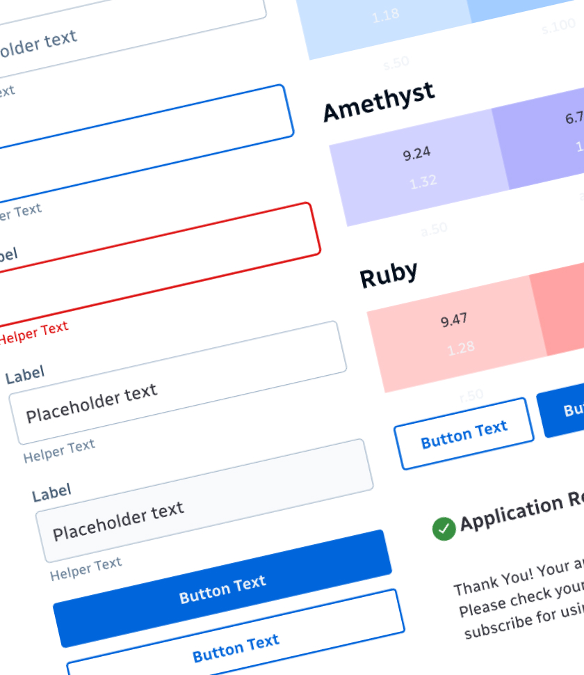
Simplify purposefully

We strike a balance between efficiency and aesthetics to allow users to focus on the outcomes of the actions they seek to accomplish.

Multiple facets of the design system

After aligning on principles, it was time to start working on the individual elements of the design system. Using Brad Frost's atomic design approach, I started with colors and typography.

Typography

There was a big opportunity as BillGO's license on their typography was expiring, and there was a need to choose a new typeface. There were some considerations for chosing a new typeface, BillGO is primarily a B2B SASS product, so partnered organizations utilize their own typface. BillGO was also trying to reduce costs, so we had to find an open source font family that could be used for internal tools and demo environments.

However, there is more to chosing a new font, than just what looks best. After walking the team through the elements of type form, contrast and pairing, we decided the typeface that worked best to reflect the design principles was Radio Canada.

Color

Through an alignment exercise with the working group, we found that BillGO had 44 different colors that weren't used across the different business lines of the organization. And when viewed collectively, the colors and gradation didn't follow a hue or value progression throughout the system--making the colors seem disjointed. There was also a set of colors, blue and purple, that were too close in value they became indistinguishable on the darker and lighter values.

When aligned by values, saturation and brightness into a single palette, it was clearer to see where adjustments and additions needed to be made. I also introduced Google's Monk Skin Tone Scale to help diversify BillGO's illustrations for more inclusive skin tones.

Components

Through an alignment exercise with the working group, we found that BillGO had 44 different colors that weren't used across the different business lines of the organization. And when viewed collectively, the colors and gradation didn't follow a hue or value progression throughout the system--making the colors seem disjointed. There was also a set of colors, blue and purple, that were too close in value they became indistinguishable on the darker and lighter values.